Wednesday, 20 October 2010

Blaine Fontana

The selection below is some of my favourite commissioned pieces of work by Blaine Fontana. He works a lot more on canvass producing a lot of fine art, however has done these pieces below for companies such as Vans, Re-vision and Kid robot. He works in print, illustration and sculpture and creates a lot of his work by repeatedly working over layer and layer until he thinks the piece is a success.  I like the history that his 2d pieces of work has, how you can see layers fading and disappearing into one another, almost like one giant montage. The toys below for Kid robot combine fine art and graphics together, the decor of the models were created using oils on canvass then printed onto plastic.


"appropriate, creative, obsessive, frustrating, organized, structured...design lives in the detail"


Motive Skateboard decks

Just a quick post. I was looking for some new shoes on www.routeone.co.uk and came across this series of skateboard decks by "motive." I'm not entirely sure who the designer is but one thing i do know is the designs work great as a quad. I like the characteristics of each animal and how they've been modified to look very jagged and almost aboriginal.

"appropriate, creative, obsessive, frustrating, organized, structured...design lives in the detial"


I, Said The Spy

This album cover below is from a local band near my hometown i really like called I, said the spy.  The album is called "Where we are going we don't need roads" and i really like the front cover. I'm really into the whole block letters/shapes space theme. The colours of the stars in the background work really well against each other.

"appropriate, creative, obsessive, frustrating, organized, structured...design lives in the detial"

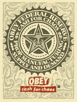
Shepard Fairy Obey Propaganda

Shepard Fairy is an American Illustrator, artist and graphic designer emerging from the late 90 skateboard culture. He is widely known for his street art, becoming more popular in 2008 when he designed the "HOPE" poster for Barack Obama in the U.S presidential election. Originally his work became more widespread because he repeated an image of wrestler "Andre the Giant" through posters and stickers all over major cities of the world. Since then his work has developed and developed producing posters and screen prints for lots of other organizations and companies. Below is a selection of some of my favourite pieces of his work. I like the colours he uses, mainly black and reds and the geometrical shapes that flow throughout each design. Each piece of work has a very defined message behind it that may not always be so obvious, however the conceptual side to his work baffles me!


 "Graphic design.....is the effective delivery of a message, idea or concept through the use of visual language."

Seb jarnot


Seb Jarnot is a french graphic designer who studied visual communication and worked in advertising agencies. From there onwards his career as a freelance illustrator began. Below are some illustrators commissioned for Jameson Chill a bottled drink. I like the naive style of these pieces and how they connect with the drink playing on the slogan "green and twisted" because the illustrations are rather unusual. Black, green and white works well together especially how the white backdrop brings out the illustrations in the foreground. 

"Graphi design.......simple and effective"

Ben Normanton Illustration

Ben Normanton is a British illustrator that creates logos, prints etc for various different companies. However he doesn't like to give to much information out about himself, but below there is a couple of videos showing him producing his work sped up.  He uses thick outer lines to define characters within his work, the subject matter is usually quite fun but at the same time twisted. I like the way he uses very eye catching colours which you could relate to comic books and cartoons.

"Appropriate, creative, obsessive, frustrating, organized, structured...design lives in the detail"


Danse Macabre

Danse Macabre in a new 2010 clothing company re-vamped from old projects and is another one of my favourite clothing labels.  I like the square block photo printed t-shirts because of their simplicity yet at the same time the way they stand out a lot more than a t-shirt with just a logo on it.  The photo prints have a lot of character about them and makes you question the reasoning behind the photo and the history to it. The Eiffel tower print below is my favourite of their latest collect because of its composition. The top point of the tower angles your eyes up to the type on the t-shirt and the clouds knock the print back so the shirt and the print become one. One colour prints are the way forward!


"Graphic Design is the effective delivery of a message, idea or concept through the use of visual language."

Wednesday, 13 October 2010

Drop Dead Clothing

Drop dead clothing is my ultimate favorite label! I love nearly every shirt in their 2010 summer collection and i own a few as well. I think this truly represents what is graphic design.


Sunday, 10 October 2010

Unknownnnnn

This is just a quick post, just found this on www.vnovember.com posted in 2008 and unlabelled. I like the combination of wet media like ink and paint mixed with digital media like the illustration of the tree. Works well! "Graphic Design.....simple and Effective!"

Ward Zwart

Wart Zwart is a german illustrator/typographer and graphic designer. He produces screen prints, posters, flyers, magazines and personal drawings all in his very unique style.

I love his style of drawing and how the way he draws his subject doesn't focus on accuracy. His faces are distorted and merged always drawn with very naive lines and almost scratched onto the paper.

Below is a selection of his flyers for various events that caught my eye. I like how basic they are but at the same time very effective. I definitely this may be a path i would like to experiment within!


I think the statement that is most appropraite to this work is "Graphic Design....simple and effective."

Graphic Design..... is the effective delivery of a message, idea or concept through the use of visual language.

This type below is what i would class as the definition of graphic design. The typeface communicates a valuable message without reading the statement that's displayed. I love how the text bleeds down the page drawing your eye from word to word.


Tuesday, 5 October 2010

5 sequences

The video below is by the graffiti artist called BLU, he uses lots of stop animation pictures of painted walls to make the artwork appear that its moving.


Below are some sequences of type i created on photoshop showing the stages between light and dark, rotation, opacity, size and removing sections of each letter. 


The video below is a time lapse from one of my favourite artists Blaine Fontana.


My good friend Michael Mooney smoking a cigarette over 6 frames. 


This animation above is Etnies snowboarder Nejc Ferjan showing him free-styling a rail for a sponsorship from Artec snowboards. Link below. 


http://etnies.com/blog/page/2/


Below are some drawings i did of an apple slowly being eaten. I thought this showed a sequence how the apple slowly disappears, bit rough/could have been sketched better.


Time lapse of a 2 foot ollie.

http://www.jeffersontodd.com/blog/pics/2008/skateboard_raul.jpg


Everybody knows Arnie Swartzy is solid;

I guess its a sequence....well kind of.