Monday, 26 September 2011

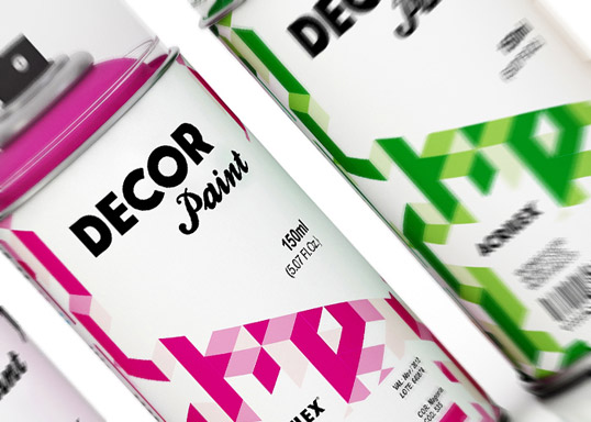
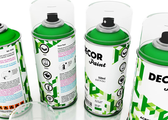
Acrilex Decor Paint...Packaging and Promotion

I need to get hold of some of these cans of paint, I love the linear and almost mathematically planned design on the cans. It gives them a completely different appeal to what your standard D.I.Y paint can would look like, almost forcing you to pick them up off the shelf. Good, well thought out design. 

BERG...Branding and Identity

Bit of Branding by the company BERG below for 'The Guild T.V' The logo they have come up with is very universal and flows nicely across the range of products its displayed on. Because of its simplicity this opens doors to the ways in which the logo can be used and It doesn't limit the ways it can be further modified as the company develops.


Sunday, 12 June 2011

Ken Richardson

This guy hits the nail on the head when he talks about how our education system works. My mum actually showed me this video because my sisters training to be a teacher alike her and my dad, but i blogged it for the illustrations/animations that elaborate his points.


Wednesday, 25 May 2011

What is Graphic Design - Part Three Chalk Typography


Some amazingly hand rendered type on a chalk board, crazy how this level of accuracy can be achieve with such an unpredictable form of media.


What is Graphic Design - Part Three Christopher Ryan


What is Graphic Design - Part Three Erik Jonsson CD Design

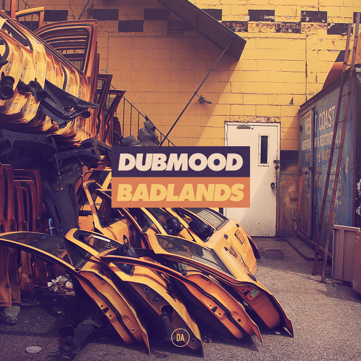
Below are a couple of CD covers produced by one of my favourite designers Erik Jonsson. 


The CD cover above has been composed really well and everything seems to fit nicely into the square bounding frame. The car doors and surroundings almost direct your eyes to the title in the middle because of the perspective of the photo. To tie the image together it looks like the photograph has been given a orange/yellow filter, helping to colour match with the centered title. The type is fresh and definitely works keeps the viewers attention by being placed directly in the center.


This sort of design reminds me of the sort of people who start hating a band when they get famous and instead they search out for something that nobody else has heard of just to be different. Its hard to note down into words but apply the same rule to design, and i could see people going out of there way to pick up CD's like these because they're not the standard thing you see when walking into HMV.

What is Graphic Design - Part Three cheesy portraits


Yes i know this video is a bit cheesy pardon the pun, but I literally blogged it because after watching I just thought "Shit, that guy just did that out of crisps."

What is Graphic Design - Part Three Falko Ohlmer


I love the combination between hand rendered type and digitally made type in the posters below. The digital type dominates the hand rendered type but at the same time works together well to be very informative. When you view the posters at a first glance you immediately notice the letter M and the Letter A,  you then go on to notice the pastel coloured type in the background, this 2 layered effect makes the poster stand out more than your regular event poster. 


What is Graphic Design - Part Three Graphisms Nebojsa Cvetkovic


 Throw elegance out of the window because being rustic is so much better. These hand drawn typographic posters by Nebojsa Cvetkovic really communicate originality, the naive illustrations and use of just black and red make these 3 posters really distinguished in style. I like the roughness of the type and the fact that not every letter is 100% accurate, the lines are bristly and the illustrations aren't exactly life like but this is what adds personality to each one.

If i had to pick one aspect of the posters that i need to carry forward into my own work it would definitely be to use less colours. As I've noticed less is more especially in terms of design, i just need to start putting that into practice.

Overall, the posters mainly attracted my attention because of the statements behind them. I like working with words and lyrics and these short sentences really pack alot of impact. Short snappy quotes that stick in your mind.


What is Graphic Design - Part Three Calango Jack is no Dull boy Posters


 Below are 3 personal posters designed by the design Firm Calango. They were created as part of a personal project not to serve any purpose other than to be visually interesting.

The depth of the shapes has been captured really well by using fading colours along the contours of the shapes making them appear 3D. The intruding white line that repeats throughout the three posters almost forces your eyes to read the imagery from the top right down to the bottom left. This works well as a forceful device over the audience almost narrowing their viewpoint to what lies around the direction of the line. 

Simple shapes and psychedelic colours really appeal to me, even if these posters aren't necessarily solving a problem they they definitely have a very valuable purpose. That purpose literally being to be visually attractive and compelling.


What is Graphic Design - Part Three The Appleseed Cast

http://www.behance.net/Gallery/The-Appleseed-Cast/440945

I really like black, single tone, linear illustration and this is something which I need to practice and practice and practice if I ever want to get good at it.  The video below shows "The Appleseed cast" poster being drawn from start to finish then the pictures below show the final outcome.

The dark blue and turquoise tones of the poster praise each other and help to bring out the dark outline of the octopus. The tentacles give the piece direction and throw your eyes from corner to corner of the poster. This would definitely stand out along a wall of your everyday bland promotional posters!

What is Graphic Design - Part Three Drop Dead 2011 Skatedecks


Dark Imagery, engrossing design and generally an all round tenebrous series of work.


What is Graphic Design - Part Three 2008 Calendar Johnathon Davies


 Found this really cool calendar on Behance linking the elements with the colours that represent them the best. Its pretty self explanatory but I just really appreciate how spot on they have matched each colour to each weather condition. Rather than a boring calendar that's hung on the wall and never gets looked at this calendar clear, easy and understandable all the things a calendar should be. I think it would appeal to a market of people from a design background, especially considering its front cover using a crisp sans serif typeface and a swatch of strong vivid colours.


What is Graphic Design - Part Three Binary Typeface


 Really like the typeface below, Its simplistic but at the same time has impact. The red and blue reminds me of the coloured filters you get in 3d glasses and the shapes of the letters remind me of the fashion designer Casette Playa who uses very basic shapes to create pattern.

Even though the letters are made from stripped down basic shapes the whole typeface comes together to create something very intricate. Its fun to read and fun to look at, could be used for many purposes as it can represent so many different things.


What is Graphic Design - Part Three Night Maps Sono graphic experiments.


http://www.behance.net/Gallery/Night-Maps-Sono-graphic-experiments_/461714

Alike to the mixed media illustrations further down my blog this designer works with lots of multiple layers to create a very establish and specific style of design. I can't get enough of digital collage, taking traditional artistic techniques and using them to influence modern pieces of design just seems to work so well, the cycle of that process then becomes exciting again.

The first poster below is my favourite out of the three i have put up just because of the simplicity of the colours used and layout of the poster. The white type compliments the grey imagery and the contour map lines in the background tie them both together.