Wednesday, 25 May 2011

What is Graphic Design - Part Three Binary Typeface


 Really like the typeface below, Its simplistic but at the same time has impact. The red and blue reminds me of the coloured filters you get in 3d glasses and the shapes of the letters remind me of the fashion designer Casette Playa who uses very basic shapes to create pattern.

Even though the letters are made from stripped down basic shapes the whole typeface comes together to create something very intricate. Its fun to read and fun to look at, could be used for many purposes as it can represent so many different things.


What is Graphic Design - Part Three Night Maps Sono graphic experiments.


http://www.behance.net/Gallery/Night-Maps-Sono-graphic-experiments_/461714

Alike to the mixed media illustrations further down my blog this designer works with lots of multiple layers to create a very establish and specific style of design. I can't get enough of digital collage, taking traditional artistic techniques and using them to influence modern pieces of design just seems to work so well, the cycle of that process then becomes exciting again.

The first poster below is my favourite out of the three i have put up just because of the simplicity of the colours used and layout of the poster. The white type compliments the grey imagery and the contour map lines in the background tie them both together.


What is Graphic Design - Part Three


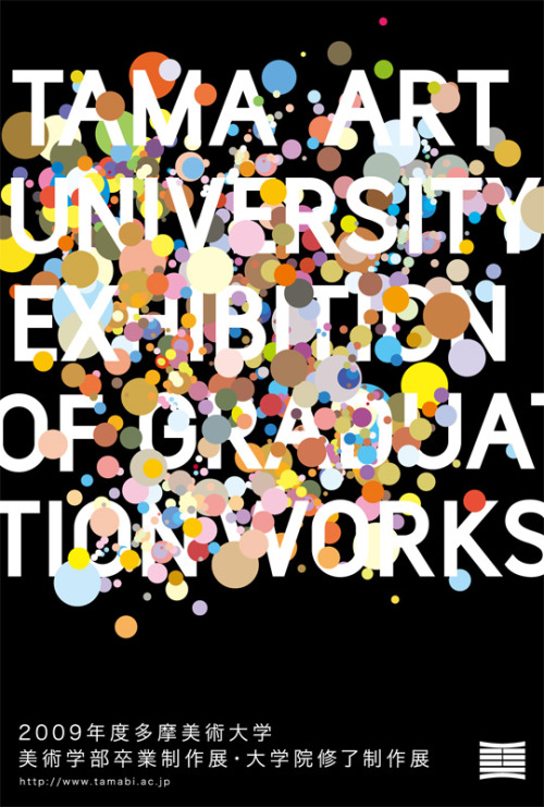
Just a quick post after this caught my eye of fffound.com. Its a Japanese poster for a university graduation and appealed to me because of the bright pastel colours and thick sans serif type.Usually University leaflets/handouts tend not to be that aesthetically pleasing but this poster definitely solves that problem. The combination of type and image works together to keep you engaged with the text that you are reading.


What is Graphic Design - Part three Disruptive By design

Disruptive by Design from Takuya Hosogane

A really nice piece of video. I love how Takuya uses shape as a vehicle to break down the borderlines of what shape is and what it can become. Flowing transitions of colour animated to give each shape very realistic attributes.

What is Graphic Design - Part Three Mixed Media Portraits


Florian Nicole creates these amazing mixed media portraits using a variety of different tools such as bic pen, watercolours, and inks touching up her work and adding texture using photoshop.


Her explanation of her work;

"I try to create an image that retains its freshness of the first paint stroke, the expressions of the line have to be very free and spontaneous..I draw a picture as if I wrote a text, with the same tool, the same freedom, with erasures, lines, scribbles etc..."

 
I think that the reason behind the portraits working so well is because as you look at them you pick out the different layers of media. So when i look at the first image below (my favourite one) i firstly see the depth of tone in the face captured by the inks, then to follow the more subtle details drawn in pen and pencil. This layered combination of media really helps to capture the character of the people in the pieces, whilst the hand rendered type works as a vehicle to slowly merge the face in the foreground into the neutral coloured backdrops. This makes you focus on the whole frame of work rather than the face itself.


What is Graphic Design - Part Three ANDWOT clothing


Another clothing company I'm loving at the moment is ANDWOT, a small skateboard apparel company from Birstol started in 2009. I swear that in the next few years they're definitely going to be a massive hit across the countries skateboarding community.

What is Graphic design for?
In this case the purpose of design is to communicate a branding in an interesting and engaging way dedicated to a specific auidience of young people interested in plain 'in your face' design.

The nautical theme is something that springs up across most of there ranges using imagery such as anchors, life rings, sailors rope etc. I like this consistency throughout their piece of design, and hopefully the more and more ranges of clothing that they bring out with follow the same theme. That way the branding will become much more recognizable down to the subject matter they choose.


What is Graphic Design - Part Three Double Exposure Portraits Dan Mountford.


Where do i start in analyzing these photos! Dan Mountford is one clever man. Combining old photographic techniques with a new sense of perspective has really worked well in the body of work below. Each photograph is utterly outstanding!


How do you do this with a camera!? Somebody please teach me! The Indian building and the side view of the girls face compliment each other the more and more you look at the photograph. The back of the girls head has been transformed into an architectural landscape and just seems to work so well.


I love the lion and the butterflies because of the textures of the wings across the lions face. The colours are very well balanced and desaturated bringing the two photos to work together as one.

What is graphic design - Part Three The Hundreds

I love street wear and one of my favourite brands is The hundreds. They're unique and their audience is so wide spread that they fit into lots of different categories, from skaters to surfers from hip hop to metal there is an huge audience they appeal to. 


Below are three of my favourite t-shirts from their new summer 2011 collection. I picked them to try and define why simple design works. I think that the reason why the hundreds has such a wide market and culture behind them is because the designs are so simplistic, that they become universal in terms of aesthetic taste.

Some one lend me like £50 so i can get a couple off their website?


What is graphic design - Part Three Melbourne Sky Diving


An amazing piece of footage that i picked out because of some of the mind bending camera angles that is uses. I love the sense of confusion that is created when you see the sun and clouds in the horizon but they're upside down or horizontal to how we'd usually view the sky. Just a generally beautiful and almost inspiring video, I just cant get enough of the way its been shot and the interesting angles the camera has been positioned in. Screen shotting this video and printing the images using a halftone or desaturated filter would be amazing!

Tuesday, 24 May 2011

What is Graphic Design- Part Three Sawdust's F&W (Fixed & What) 2011

Below is a magazine spread designed by the design company sawdust for a launch publication of the bike blog fixed and what. It appealed to me because of the interesting and eye-catching layout it used and the good used of type. 

The audience reading and viewing the double page spread would most likely be cyclists using fixed gear bikes. The type in the middle immediately got my attention because of the modifications to each individual letter anatomy, Interesting little adjustments to keep you engaged. I was then are pushed back by the image on top of the bike then to follow the text down the page on the left. You could say the rule of three has been applied to the layout of the page categorising the type and image into sections,  for example The heading in the background, the bike image in the foreground, and the text + images on the left hand side of the page. 


What is Graphic Design- Part Three Richard Stewart Vintage Packaging

http://www.thedieline.com/blog/2011/3/15/designer-spotlight-richard-arthur-stewart.html?utm_source=feedburner&utm_medium=feed&utm_campaign=Feed%3A+TheDieline+%28TheDieline.com+-+Blog+-+World%27s+%231+Package+Design+Website%29&utm_content=Google+Reader


Below are 2 projects by Richard Arthur Stewart that i found whilst on stumble upon. I put them up because i love the vintage feel and very superior quality they have to them. Realistic single tone illustrations combined with strong readable type has proved to be an excellent vehicle of communication.


What is Graphic Design- Part Three Ministry of Type Michah Lexier


Below is literally one of the most interesting play on words i think I've come across when looking at design. Personally I think it is and designed to stimulate thought, and to get you thinking about equality, the fact that both paragraphs are exactly the same but very diverse in terms of language could be reflected across lots of everyday subjects for example racism.  The shop window is a perfect canvass to reach a large audience of people walking by, I definitely would stop to read the words on the window solely down to how eye catching the text is and the way its been arranged. I like the thought behind this piece as its not just another quotation on a wall its actually got a deeper sense of meaning.


What is Graphic Design- Part Three Sawdust Be events 2009 A4 flyer

http://www.madebysawdust.co.uk/archive/be-events-2009/

This flyer (Front on the left, back on the right) define the areas of graphic design that i want to work towards, i love electronic, vivid almost space influenced design and being able to produce a piece of work like below would be top!

To start, the "2009" type on the front of the fold out flyer is what firstly caught my eye, the rainbow of mixed colours and the sharp edges of the typeface work really well together and serve the purpose to represent the event they are advertising.

The arrangement of the type of the back of the flyer is also very interesting, Again vivid colours have been used as the fill colour for dates of the artists playing, complimented by the off white text that flows across and beneath the headings. Not only that, but the text has been set out in such a visually pleasing way that it keeps you reading what is in front of you.

The flyer is part of a series of promotional material so i would imagen that this would be something you could pick up in shops, the back of a magazine or maybe a handout by reps in the street. This widens the market but limits the things you could do with the flyer, for example as the audience you are delivering the flyer to may not appreciate good design its better to keep things plain and simple. Illustrations/images over complicating the page would be contrary to what they are trying to achieve, as this flyer is more about communicating information well rather than baffling the audience with some fantastic piece of artwork.


What is Graphic Design- Part Three Creative Review John Sibbick's Flesh and Bone


http://www.creativereview.co.uk/cr-blog/2011/may/john-sibbicks-flesh-and-bone-and-nobrow-wrapping-papers

Found this whilst browsing on creative review, an interesting fold out booklet of animals and animal anatomy illustrated in pencil. The animals are so realistic and accurate that this is a perfect demonstration of the accuracy of Jogn Sibbicks rendering with a pencil, I need to try and get drawing for more than an hour everyday if i want to aspire to being anything close to this.
Below is a little bit of information on the artist.

"Sibbick has been drawing animals for about 25 years and is probably best known for creating prehistoric landscapes abound with dinosaurs and other ancient beasts. He regularly produces a diverse range of meticulously researched creature illustrations for clients including National Geographic, Puffin Books, and London's Natural History Museum. Here's a look at his just-published Nobrow publication, Flesh and Bone: A Colouring Concertina..."

The function and purpose behind the booklet could be more than just the obvious. The book's main purpose is to be coloured in, however it could be left as it is, folded out and read, or maybe even just displayed on your wall because of the detail in the illustrations.


From the front to back the animals loose their flesh and fur but to remain in the same positions giving you the opportunity to interact more with what you are looking at. I'm a bit fan of anatomy and the more I'm thinking about it the more i need to buy this book! If you're the same then there's a link below;

nobrow.net


What is Graphic Design- Part Three Tuboat Print Workshop