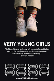
As i was making my own mailshot of child trafficking i thought it would be a good idea to seee what current graphic design relates to my subject. I found these 3 posters below, even though the subject matter was not the most optimistic thing to be presented with i really liked the thoughts behind them in relation to layout, colour and message.
This poster above it the one i think is most eye catching solely down to the colours it used. The red crossed out woman's mouth immediately catches your attention and then draws you to the message to the right of it. The black and light blue type works well together, by using a sans serif typeface the statement is much clearer to read therefore sticks in your mind much longer.


