
Wednesday, 28 September 2011
Jobs Involved around spray painting.....
I just found a job online for spray painting aircraft, and learning about the skills involved with spraying planes with paint. This goes to show thats its not just about tagging the bus stop at the top of your road.
Monday, 26 September 2011
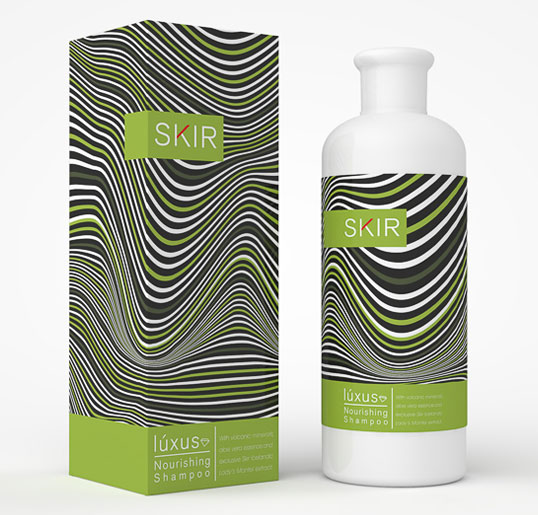
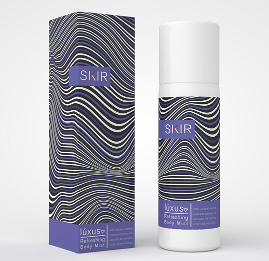
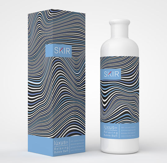
Denis Carroll Beauty Products - Packaging and promotion
"A range of organic beauty products with volcanic minerals and aromatic essences.
The pattern I created is representative of volcanic sedimentary layers. It is used with variations of colour across the range. In turn, the product colour is representative of the aromatic essence inside.”
Works well in all three colours, The design on the front is constantly changing when I look at it, well it seems that way because of the different spacing between the contour lines of the design. I like that the labeling is almost confusing on the eyes, because this is what makes me want to look at it more.
Talking & Teaching Type - Publishing and Editorial
This double-sided poster promoted Tobias Frere-Jones’ visit to Melbourne for a conference and typographic masterclass. A staged photograph displays contextual examples of his typefaces in various printed material. The type designer is represented in a featureless portrait, a reference to the anonymity associated with his profession.
Design: Hofstede Design
Dimensions: 594mm x 420 mm
Printing: Offset litho
Typography: Mercury Text & Mercury Display
http://www.septemberindustry.co.uk/hofstede-design/
Really interesting fold out poster that personally I only think works because it folds out. The creases of the paper add to the photograph on the back side of the print, giving the image much more definition because the darker areas of the paper where the surface has creased helps to push the image back, but at the same time draws the sections of type forward. Its very well layed out so that when in the process of being unfolded the audience is fed snippets of text, then you fold out the paper in its entirety to see the bigger picture. However when completely folded down you could imagen the oblong shaped piece of paper to simply be a business card.
Internet Usage Infographic- Information and wayfinding
Another infographic I came across below, both informative and visually stimulating. This poster was made to elaborate on the usage of the internet for the company Intel, It doesn't feed you piles and piles of nonsense just strict essential facts that have been presented in a way to keep your attention span ticking over. I like the layout of the poster, how the combination of different colours starts at the top and slowly fizzles out into the rest of the page bringing your eyes down with it as you read the information on either side.

Pikes Peak Course - Information and Wayfinding
I'm not a massive fan of Info graphics but this one really appealed to me because it isn't overpowering me with information and there isn't too much to digest at once. It was a cutting in a magazine marking out the route down the side of a mountain. The choppy, pixelated texture of the graphics adds character to the information provided and makes you want to find out a bit more about what you're reading.


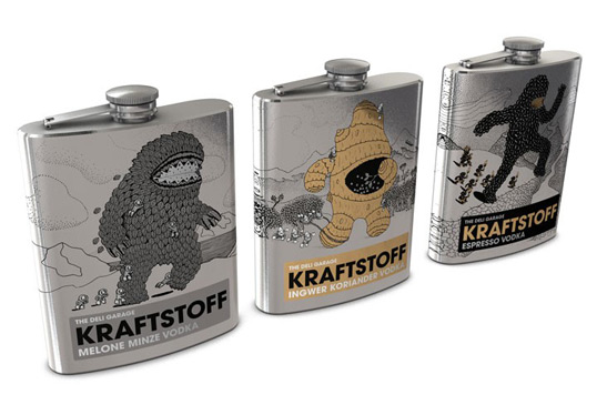
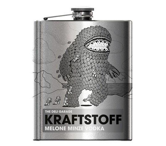
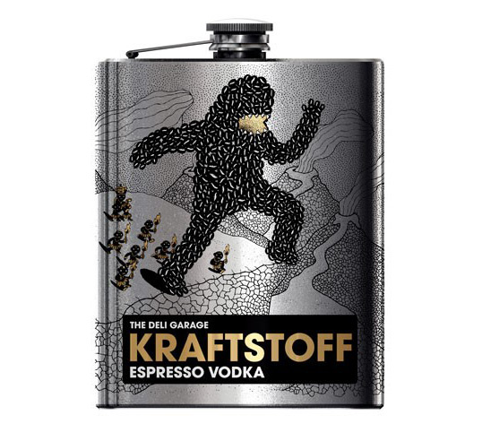
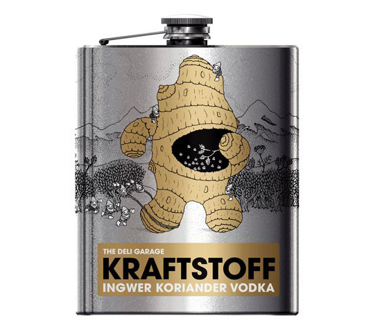
The Deli Garage Kraftstoff Vodka- Packaging and Promotion
http://lovelypackage.com/the-deli-garage-kraftstoff-vodka/
“The flasks can hold 0.2 litres. The writing is in German, the flavours are espresso, ginger-coriander and melon-mint. The package design won an award at this year’s German Art Director’s Club (ADC) Competition.”
Metallic colours are a winner! I love how the shiny surface of the metal hipflask shines through the design on the outside, It makes it seem so much more complete than just a sticker or a label. I doubt i will ever get the chance in the near future to print onto metal, but yeah what a good series of work.
Anti-Theft Lunchbags...Packaging and promotion
The plastic bags below play on one of the most common squeamish fears most people have and that's moldy food. What better way to keep your work colleagues/friends at college away from eating your sandwiches. A straight forward vehicle of design that will prevent most people from going near your lunchbox, I love the way this has been thought out so well. The pack that the sandwich bags come in is rather nice in itself, plain black type on brown paper really appeals to me because of how clean it looks. Definitely need to start playing around printing on different stocks. I'm not entirely sure how they printed the green splodges on the plastic bags but that would be something to further look into.


Allan Peters - Nike Motorcross - Branding and Identity
I realize the logo designs below are digitally designed, but they are designed for print and I couldn't help but blog them. They really highlight the fact that less is more. They remind me of some Superdry designs, playing with vintage petrol can designs and mechanical themed design, you could imagine any of these on the side of a 1960's 125cc bike. The orange and black compliment each other, bringing together some very well thought out pieces of logo design.
Designed by Allan Peters for Nike 6.0 Motorcross
Designed by Allan Peters for Nike 6.0 Motorcross
Trigger Oslo - Branding and Identity
'Trigger Oslo is a new PR company focusing on engaging communication. The identity is developed to create a range of personal signatures within the same visual language and color palette. The colors and design emphasizes an agency that focus on a more welcoming approach, inviting customers for a good conversation and a nice atmosphere rather than the cynical and corporate identities that colors the rest of the industry.'
http://www.behance.net/gallery/Trigger-Oslo-Identity/1066863
Even though the design below doesn't necessarily appeal to me I picked it because of how continuous and flowing the branding works. From pencils to t-shirts, from cd's to badges you can constantly recognize the same devices used to link them together. Whether its the colour or the type, they both work in the same way to familiarize their audience of what they are looking at so when they look at a second glance they can associate each item with the same company without thinking about it.


Freshcuts Recordings 12 inch Vinyl - Packaging and Promotion
We love it (Series)
Vinyl 12″
Record cover for “We love it”. A series of exclusive releases pressed on vinyl by Freshcuts Recordings. Limited to 300 copies. This is the first 12″ of the series. The photography concept is based on an evolution of the picture. With every release an object or something else from the artist or the song will be placed in the picture. So the content grows until the last release. The finished series with all releases will be available in a wooden box.
Theres nothing better than Vinyl, I wish I owned some of my own but when you grow up in a generation of MP3's and CD's it hard to get into collecting. The saturated and pastel colours work well against the bold black clean cut type and give the record sleeve a very formal feeling. I like the sticker in the middle of the vinyl, it corresponds to the design on the sleeve and almost completes the whole package.


Rosario Florio & Larissa Kasper – Branding and Identity
Another really good eample of simple but effective branding, I love the simple vehicle of switching round the positions of the letter A and R to create a piece of intriguing work. Colours work well, Layout works better


Mmeory stick cork....Packaging and promotion

I know you can't really class this as a form of packaging but what an ingenious idea for housing a memory stick. I love the thought process behind it, and the fact its turning something old into something new. At the same time it contrasts that corks have been around for decades and decades where as memory sticks are something of the 21st century. Simple and Effective. Boom.
By the way, if You want one, you can order them off amazon;
http://www.amazon.co.uk/Novelty-Pattern-Bamboo-Memory-Shipping/dp/B004ZTKFM0
By the way, if You want one, you can order them off amazon;
http://www.amazon.co.uk/Novelty-Pattern-Bamboo-Memory-Shipping/dp/B004ZTKFM0
Hofstede Design...Publishing & Editorial
Architects EAT
Design: Dominic Hofstede
Dimensions: 315mm x 240mm
Printing: HP Indigo digital
Typography: Bureau Grotesque & Pica 10 Pitch
I really like the Book that Hofstede Design put together for Architects EAT, mainly because of the colours they used, the light grey type works well on a matt black background and gives you a sense of sovereignty.


Berlin Map Contempory Catalogue...Information & Wayfinding
I picked out this catalogue solely down to the use of colour and layout. Using such a bold, vibrant yellow immediately attracts you to whats in front of your eyes, and takes away the effort of reading the information displayed. If i was to see this much text on a white background I'd be put off to read it because I don't find it at all visually interesting. I definitely need to experiment with brighter colours in my work!


All you Need to Know about Graffiti Is in this book...Publishing & Editorial
All you Need to Know about Graffiti Is in this book......
Love the idea behind this, so well thought out yet so simplistic. A really nice piece of print, mainly being the clean cut typography on the front cover, It plays on the fact that the only way to learn anything about graffiti is with a spray can.


