"Graphic design......simple and effective"
Sunday, 24 October 2010
Motion typography the 8 rules of fight club
Great film, amazing type simple as that. This video really communicates its point across jumping from word to word to help engage the audience in what they are reading
Space Invader
Space invader is a French street artist who plays with the characters from old Atari console games. He sticks up his tiled pieces of work in cities all over the world labeling them as being space invaded. The pieces below are made entirely from rubics cubes and show famous scenes/people from films and fashion. The contrast between being simple and complicated is what appeals to me within his work. A pixelated image in a video game could be seen as being simple but when space invader has replicated these images in a much larger scales limited to 6 colours is suddenly becomes much more complex.
"Graphic Design is the effective delivery of a message, idea or concept through the use of visual language."


IAMOKAT
I spotted "IAMOKAT" in the book Custom Kicks by MAKI. His work was featured in the book because of a piece of work he did about drawing on shoes. The idea of customizing a shoe to give it character and definition is something that really interests me. Might have to invest in some Plain pumps and marker pens!
"Appropriate, creative, obsessive, frustrating, organized, structured...design lives in the detail"


Angus Hyland
"The discipline of graphic design will continue to evolve through technological and aesthetic advances, adapting to meet the needs of the market in an increasingly fashion-conscious world"
I like Angus Hyland because when you look at his work you can almost backtrack on the amount of experimentation that has gone into producing his final pieces.
"Graphic design......simple and effective."
http://pentagram.com


Alex Pardee
Alex Pardee is another American illustrator who has created work for bands such as The used and In Flames. He bases his subject matter on dreams/nightmares that hes had where he has come across monsters and beasts that he reproduces in his work. I like he uses clashing colours to give dynamic effect to the characters he creates, it makes them look as if they're almost washing off the page.
"Appropriate, creative, obsessive, frustrating, organized, structured...design lives in the detail"


Dan Mumford
The 3 prints below are from a selection of work by Illustrator Dan Mumford. I picked these three due to their impact they had on me when i looked at them, the expression and emotion they represent really stands out whilst at the same time they represent a lot of skill within screen printing.


"Graphic Design.......simple and effective."


Johnny Cupcakes
Johnny Cupcakes is an American Brand of clothing recognized for their signature cupcake Logo. Not only do i like their clothes but i really like the way their website is arranged. The black on white links and text flow nicely across the top of the page so its easily accessible and the layout makes it easy for you to browse around the website without getting hooked on tons of links. When you hover over an image the black shapes turn blue, i think this simple colour choice reflects on the point that its easy to use because you immediately know what is selected.
"Graphic design.....is the effective delivery of a message, idea or concept through the use of visual language."


ESP Lyra Custom Guitar
This boggles my mind! I like the concept that graphic design doesnt just have to be printing posters and flyers and that really design is anything with a purpose. ESP/LTD make guitars used by millions of people all over the world and the video below is of the artist Lyra customising the pick ups/bridge and scratch plate with a piece of comicbook art.
"Graphic design.....is the effective delivery of a message, idea or concept through the use of visual language."
Michael Shantz
Michael Shantz produces work for alot of mainstream bands and clothing companies illustrating album covers and t-shirts with gory imagery and melting typefaces. I love his style and how his work is very dark and gloomy, using subjects which most other graphic designers wouldn't think twice about using. his work had a childlike charisma about it, i could imagine sketches alike the ones below in some of my high school science books.
"Graphic design.....is the effective delivery of a message, idea or concept through the use of visual language."


lynne Perella
Lynne Perella is one of my favorite fine artists. I love her work because of its vibrant colours and slap dash sort of style. Even though its not necessarily Graphic Design her use of type and composition encourages me to use alternative media to just working on illustrator and photoshop and to start to get back to basics.
"appropriate, creative, obsessive, frustrating, organized, structured...design lives in the detail"


Wednesday, 20 October 2010
Blaine Fontana
The selection below is some of my favourite commissioned pieces of work by Blaine Fontana. He works a lot more on canvass producing a lot of fine art, however has done these pieces below for companies such as Vans, Re-vision and Kid robot. He works in print, illustration and sculpture and creates a lot of his work by repeatedly working over layer and layer until he thinks the piece is a success. I like the history that his 2d pieces of work has, how you can see layers fading and disappearing into one another, almost like one giant montage. The toys below for Kid robot combine fine art and graphics together, the decor of the models were created using oils on canvass then printed onto plastic.
"appropriate, creative, obsessive, frustrating, organized, structured...design lives in the detail"


Motive Skateboard decks
Just a quick post. I was looking for some new shoes on www.routeone.co.uk and came across this series of skateboard decks by "motive." I'm not entirely sure who the designer is but one thing i do know is the designs work great as a quad. I like the characteristics of each animal and how they've been modified to look very jagged and almost aboriginal.
"appropriate, creative, obsessive, frustrating, organized, structured...design lives in the detial"


I, Said The Spy

This album cover below is from a local band near my hometown i really like called I, said the spy. The album is called "Where we are going we don't need roads" and i really like the front cover. I'm really into the whole block letters/shapes space theme. The colours of the stars in the background work really well against each other.
"appropriate, creative, obsessive, frustrating, organized, structured...design lives in the detial"
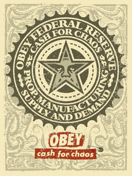
Shepard Fairy Obey Propaganda
Shepard Fairy is an American Illustrator, artist and graphic designer emerging from the late 90 skateboard culture. He is widely known for his street art, becoming more popular in 2008 when he designed the "HOPE" poster for Barack Obama in the U.S presidential election. Originally his work became more widespread because he repeated an image of wrestler "Andre the Giant" through posters and stickers all over major cities of the world. Since then his work has developed and developed producing posters and screen prints for lots of other organizations and companies. Below is a selection of some of my favourite pieces of his work. I like the colours he uses, mainly black and reds and the geometrical shapes that flow throughout each design. Each piece of work has a very defined message behind it that may not always be so obvious, however the conceptual side to his work baffles me!


 "Graphic design.....is the effective delivery of a message, idea or concept through the use of visual language."


