Some amazingly hand rendered type on a chalk board, crazy how this level of accuracy can be achieve with such an unpredictable form of media.
Wednesday, 25 May 2011
What is Graphic Design - Part Three Erik Jonsson CD Design
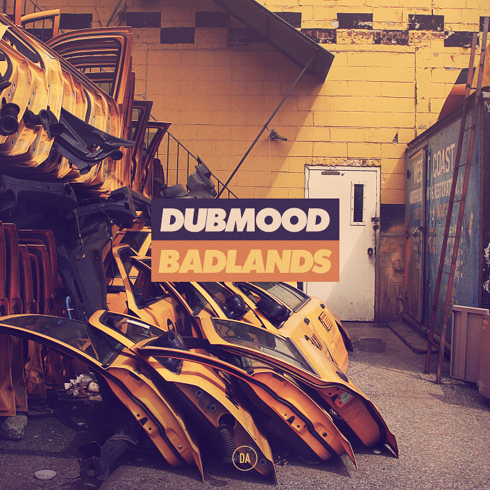
Below are a couple of CD covers produced by one of my favourite designers Erik Jonsson.
The CD cover above has been composed really well and everything seems to fit nicely into the square bounding frame. The car doors and surroundings almost direct your eyes to the title in the middle because of the perspective of the photo. To tie the image together it looks like the photograph has been given a orange/yellow filter, helping to colour match with the centered title. The type is fresh and definitely works keeps the viewers attention by being placed directly in the center.
This sort of design reminds me of the sort of people who start hating a band when they get famous and instead they search out for something that nobody else has heard of just to be different. Its hard to note down into words but apply the same rule to design, and i could see people going out of there way to pick up CD's like these because they're not the standard thing you see when walking into HMV.
What is Graphic Design - Part Three cheesy portraits
Yes i know this video is a bit cheesy pardon the pun, but I literally blogged it because after watching I just thought "Shit, that guy just did that out of crisps."
What is Graphic Design - Part Three Falko Ohlmer
I love the combination between hand rendered type and digitally made type in the posters below. The digital type dominates the hand rendered type but at the same time works together well to be very informative. When you view the posters at a first glance you immediately notice the letter M and the Letter A, you then go on to notice the pastel coloured type in the background, this 2 layered effect makes the poster stand out more than your regular event poster.
What is Graphic Design - Part Three Graphisms Nebojsa Cvetkovic
Throw elegance out of the window because being rustic is so much better. These hand drawn typographic posters by Nebojsa Cvetkovic really communicate originality, the naive illustrations and use of just black and red make these 3 posters really distinguished in style. I like the roughness of the type and the fact that not every letter is 100% accurate, the lines are bristly and the illustrations aren't exactly life like but this is what adds personality to each one.
If i had to pick one aspect of the posters that i need to carry forward into my own work it would definitely be to use less colours. As I've noticed less is more especially in terms of design, i just need to start putting that into practice.
Overall, the posters mainly attracted my attention because of the statements behind them. I like working with words and lyrics and these short sentences really pack alot of impact. Short snappy quotes that stick in your mind.
What is Graphic Design - Part Three Calango Jack is no Dull boy Posters
Below are 3 personal posters designed by the design Firm Calango. They were created as part of a personal project not to serve any purpose other than to be visually interesting.
The depth of the shapes has been captured really well by using fading colours along the contours of the shapes making them appear 3D. The intruding white line that repeats throughout the three posters almost forces your eyes to read the imagery from the top right down to the bottom left. This works well as a forceful device over the audience almost narrowing their viewpoint to what lies around the direction of the line.
Simple shapes and psychedelic colours really appeal to me, even if these posters aren't necessarily solving a problem they they definitely have a very valuable purpose. That purpose literally being to be visually attractive and compelling.
What is Graphic Design - Part Three The Appleseed Cast
http://www.behance.net/Gallery/The-Appleseed-Cast/440945
I really like black, single tone, linear illustration and this is something which I need to practice and practice and practice if I ever want to get good at it. The video below shows "The Appleseed cast" poster being drawn from start to finish then the pictures below show the final outcome.
The dark blue and turquoise tones of the poster praise each other and help to bring out the dark outline of the octopus. The tentacles give the piece direction and throw your eyes from corner to corner of the poster. This would definitely stand out along a wall of your everyday bland promotional posters!
What is Graphic Design - Part Three Drop Dead 2011 Skatedecks
Dark Imagery, engrossing design and generally an all round tenebrous series of work.
What is Graphic Design - Part Three 2008 Calendar Johnathon Davies
Found this really cool calendar on Behance linking the elements with the colours that represent them the best. Its pretty self explanatory but I just really appreciate how spot on they have matched each colour to each weather condition. Rather than a boring calendar that's hung on the wall and never gets looked at this calendar clear, easy and understandable all the things a calendar should be. I think it would appeal to a market of people from a design background, especially considering its front cover using a crisp sans serif typeface and a swatch of strong vivid colours.
What is Graphic Design - Part Three Binary Typeface
Really like the typeface below, Its simplistic but at the same time has impact. The red and blue reminds me of the coloured filters you get in 3d glasses and the shapes of the letters remind me of the fashion designer Casette Playa who uses very basic shapes to create pattern.
Even though the letters are made from stripped down basic shapes the whole typeface comes together to create something very intricate. Its fun to read and fun to look at, could be used for many purposes as it can represent so many different things.
What is Graphic Design - Part Three Night Maps Sono graphic experiments.
http://www.behance.net/Gallery/Night-Maps-Sono-graphic-experiments_/461714
Alike to the mixed media illustrations further down my blog this designer works with lots of multiple layers to create a very establish and specific style of design. I can't get enough of digital collage, taking traditional artistic techniques and using them to influence modern pieces of design just seems to work so well, the cycle of that process then becomes exciting again.
The first poster below is my favourite out of the three i have put up just because of the simplicity of the colours used and layout of the poster. The white type compliments the grey imagery and the contour map lines in the background tie them both together.
What is Graphic Design - Part Three
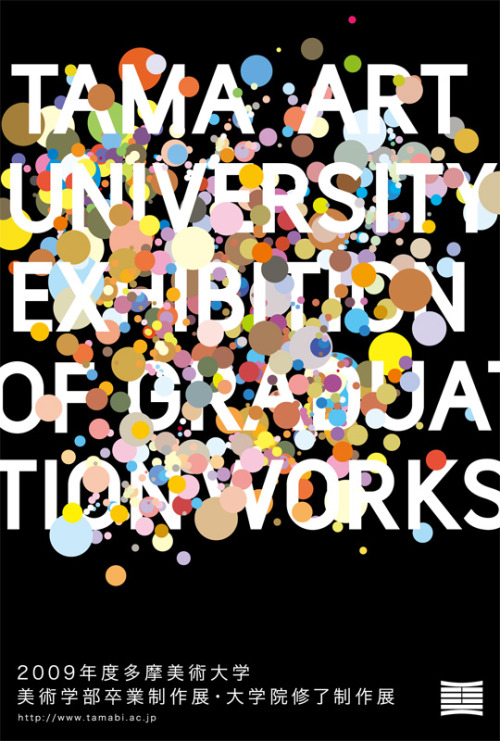
Just a quick post after this caught my eye of fffound.com. Its a Japanese poster for a university graduation and appealed to me because of the bright pastel colours and thick sans serif type.Usually University leaflets/handouts tend not to be that aesthetically pleasing but this poster definitely solves that problem. The combination of type and image works together to keep you engaged with the text that you are reading.
What is Graphic Design - Part three Disruptive By design
Disruptive by Design from Takuya Hosogane
A really nice piece of video. I love how Takuya uses shape as a vehicle to break down the borderlines of what shape is and what it can become. Flowing transitions of colour animated to give each shape very realistic attributes.
A really nice piece of video. I love how Takuya uses shape as a vehicle to break down the borderlines of what shape is and what it can become. Flowing transitions of colour animated to give each shape very realistic attributes.
What is Graphic Design - Part Three Mixed Media Portraits
Florian Nicole creates these amazing mixed media portraits using a variety of different tools such as bic pen, watercolours, and inks touching up her work and adding texture using photoshop.
Her explanation of her work;
"I try to create an image that retains its freshness of the first paint stroke, the expressions of the line have to be very free and spontaneous..I draw a picture as if I wrote a text, with the same tool, the same freedom, with erasures, lines, scribbles etc..."
I think that the reason behind the portraits working so well is because as you look at them you pick out the different layers of media. So when i look at the first image below (my favourite one) i firstly see the depth of tone in the face captured by the inks, then to follow the more subtle details drawn in pen and pencil. This layered combination of media really helps to capture the character of the people in the pieces, whilst the hand rendered type works as a vehicle to slowly merge the face in the foreground into the neutral coloured backdrops. This makes you focus on the whole frame of work rather than the face itself.
What is Graphic Design - Part Three ANDWOT clothing
Another clothing company I'm loving at the moment is ANDWOT, a small skateboard apparel company from Birstol started in 2009. I swear that in the next few years they're definitely going to be a massive hit across the countries skateboarding community.
What is Graphic design for?
In this case the purpose of design is to communicate a branding in an interesting and engaging way dedicated to a specific auidience of young people interested in plain 'in your face' design.
In this case the purpose of design is to communicate a branding in an interesting and engaging way dedicated to a specific auidience of young people interested in plain 'in your face' design.
The nautical theme is something that springs up across most of there ranges using imagery such as anchors, life rings, sailors rope etc. I like this consistency throughout their piece of design, and hopefully the more and more ranges of clothing that they bring out with follow the same theme. That way the branding will become much more recognizable down to the subject matter they choose.
What is Graphic Design - Part Three Double Exposure Portraits Dan Mountford.
Where do i start in analyzing these photos! Dan Mountford is one clever man. Combining old photographic techniques with a new sense of perspective has really worked well in the body of work below. Each photograph is utterly outstanding!

How do you do this with a camera!? Somebody please teach me! The Indian building and the side view of the girls face compliment each other the more and more you look at the photograph. The back of the girls head has been transformed into an architectural landscape and just seems to work so well.
I love the lion and the butterflies because of the textures of the wings across the lions face. The colours are very well balanced and desaturated bringing the two photos to work together as one.
What is graphic design - Part Three The Hundreds
I love street wear and one of my favourite brands is The hundreds. They're unique and their audience is so wide spread that they fit into lots of different categories, from skaters to surfers from hip hop to metal there is an huge audience they appeal to.
Below are three of my favourite t-shirts from their new summer 2011 collection. I picked them to try and define why simple design works. I think that the reason why the hundreds has such a wide market and culture behind them is because the designs are so simplistic, that they become universal in terms of aesthetic taste.
Some one lend me like £50 so i can get a couple off their website?


